Immerse yourself in a world of selections at one of our stunning East Coast showrooms. Architessa sources our tile both domestically and internationally, bringing the best of porcelain, natural stone, ceramic, and more to convenient locations and through our national commercial representatives Contact us to explore an in-store or virtual appointment with an Architessan. Orders ship worldwide or can be picked up at Architessa's warehouse locations. Delivery options are available for orders within Virginia, Maryland, and D.C.
Immerse yourself in a world of selections at one of our stunning East Coast showrooms. Architessa sources our tile both domestically and internationally, bringing the best of porcelain, natural stone, ceramic, and more to convenient locations and through our national commercial representatives.
Contact Us to explore an in-store or virtual appointment with an Architessan. Orders ship worldwide or can be picked up at Architessa's warehouse locations. Delivery options are available for orders within Virginia, Maryland, and D.C.
Okay, so grout is NOT the most interesting thing to read about; however, it’s such an important part of design!
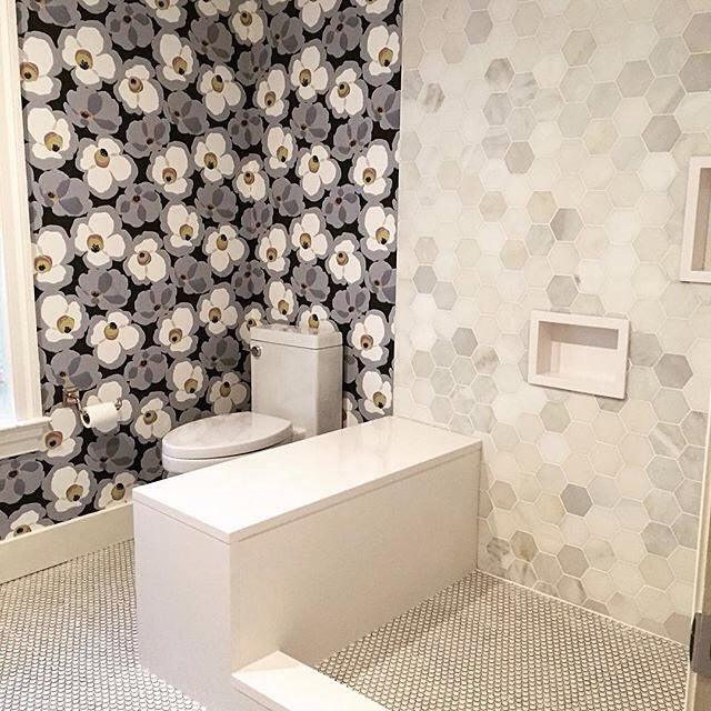
I recently saw this awesome photo on Ella Scott Design’s Instagram page that had our 4” Calacatta Chablis Hexagon mosaic on the wall and penny round mosaic on the floor. The design was stunning, so obviously I inquired about it from our internal designer / salesperson. And she said something interesting to me, “She (Ella) wanted to use the dark grey grout with all that but the contractor had used something of their own. It would have been much better I think with the wallpaper.”
Now don’t get me wrong, I think that it looks great installed with a neutral grout that matches the tile, but I can see why both designers would have wanted a charcoal color grout to pull in the wallpaper. And not to mention, it’s a good lesson for us that we have to be intimately involved with what our contractor is doing because tile and grout does not easily come out!
So, how do we make sure we select the right grout?
First you have to decide if you want the grout to blend-in with the tile (uniformity) or if you want it to pop (contrast). These 2 installs below both use the same ceramic 3x6 Basics Snow White Glossy tile, one is installed with a contrasting dark grout and one is installed with matching grout. You can see that the exact same tile can have 2 completely different looks. Both are equally nice, it’s purely just a matter of what style you are looking for.
Uniformity: If you are going for the blending in sort of look, the main thing is to have the grout be as close in color as possible. If you can’t get an exact match go for the slightly lighter, NOT the darker option. If you sew you know the same goes for picking thread. You don’t want the grout to be what pulls your attention and you end up with a checkerboard look that you didn’t want.
Contrast: If you are going for a contrasting look, you should bring all your room pieces together in one place with the grout and tile. For example, your countertop, your cabinet, your paint / wallpaper, fabric (cushions / window fittings), furniture, pictures, any accessories that are going to be a focal point in the room like towels or decorations. Once you have all these items together, then you want to make sure that you are happy with the colorway and the grout choice. I’m going to be writing a whole blog on color pallets, so stay tuned for that if you’re struggling with colors. However, a rule of thumb I like to follow is to limit your color pallet to 3 colors per room (not including white / neutrals). I know sometimes you can get away with more and sometimes just doing a 2 color theme is great too (like black & white or grey & yellow), but in most instances you typically see 3 colors.
Once you’ve decided that, here are some important things to consider.
Grout Expires: Grout has expiration dates! Even though you can technically get away with using it if its expired, I wouldn’t suggest doing so because you run the risk of the color not coming out the way you want it.
Matching Caulk: You can actually buy caulk that matches your grout rather than just going with a standard white or clear. It’s a nice touch to have matching grout and caulk to get a clean look.
Lifetime Warranty: If you ask one of our designers, Laticrete has lifetime warranty available which is really worth the extra cost over a Custom grout.
Grout Spacing: Depending on the spacing you want between your tiles, there is a different type of grout that should be used if it wasn’t already complicated enough. :) See the chart below.
Grout / Water Mixture: If the mixture is not done right you can end up with light spots in a supposed to be dark grout like the image below. Typically in white or light colored grouts you don’t have this problem as much, but in dark grouts its super obvious. The grout is supposed to be all the dark color you can see in the image. I also think the room temperature and humidity have an impact on this, but I can’t prove that its just a hypothesis.
Epoxy Grout: Epoxy grout is a highly recommended grout however it is not suitable for all applications (like glass or polished stone). It also requires immediate clean off.
Grout Cleaner: I recommend Miracle Tile & Stone Cleaner. I’m sure they have different instructions on the video, but the way I use it for grout is a pour a little puddle on my stained or dirty grout, let it sit overnight, then come back with another little puddle and a light scrub. It has always come up spotless for me. And I don’t have to do any labor intensive scrubbing, just let it soak. I came upon this method because I don’t like scrubbing! :)
Grout Color Matching: I recommend Permacolor Select from Laticrete (see here) in which you can match your grout to any color needed- aka think any color by Sherwin Williams and/or Benjamin Moore... that's a lot of colors!