During the last few years, we’ve discovered that colors can bring us emotional respite in times of trouble. Calming tones helped us get through the darkest days of the pandemic and continue to offer solace in these uncertain times. In 2022, for example, we sought comfort from a variety of earthy tones, along with energy from a few brighter hues.
These interior design styles will continue to dominate in 2023, as reflected in the latest Colormix forecast from Sherwin-Williams. The new year will represent a big step forward for earthy vibes, best captured by the re-emergence of brown.
Underscoring top design trends for 2023? Our collective desire to become more grounded. At this point, we crave wisdom and comfort – qualities exemplified by the rich, yet neutral-dominant palettes of tomorrow.
TerraEvery year, Colormix’s dominant concept captures where we’re at and how colors play into these collective feelings. For 2023, the name of the game is Terra.
This concept draws attention to everything that makes our beloved planet unique: the forests, mountains, oceans, wildlife, and even the vibrant mix of cultures that mankind brings to the table.
As Sherwin-Williams' Director of Color Marketing, Sue Wadden, explains, Terra builds on “our connection to the Earth,” which will “influence our global outlook in the months to come.”
The Terra collection is comprised of forty colors spanning four main palettes:
Biome: Our World, Our Home
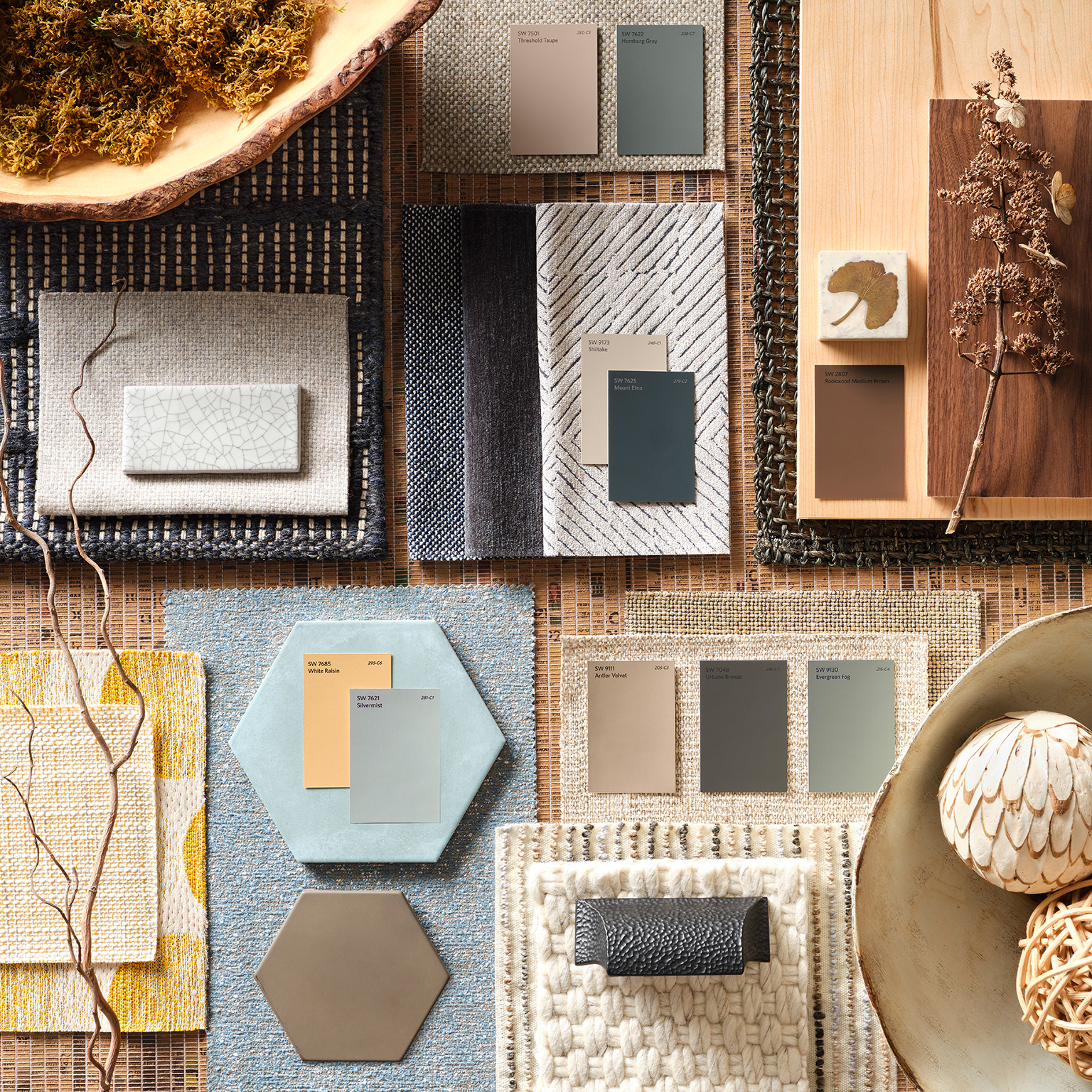
Biophilic design was a big deal in 2022 and will be even more dominant next year. This nature-driven approach strengthens humans’ connection to Mother Nature via strategic design.
This goal plays out in the Biome palette, which emphasizes the aforementioned calm of brown, as well as muted shades of green and blue.
Lore: Our Wellspring of Innovation
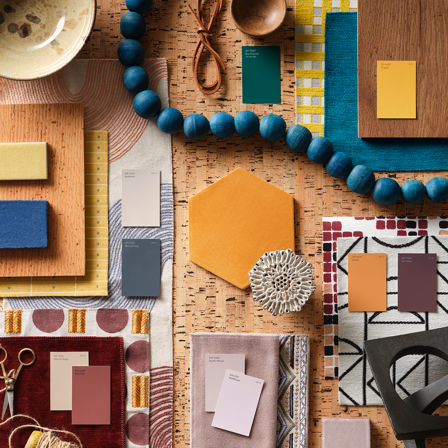
As a grounded celebration of artistry, Lore pays homage to the creative pursuits that give our life meaning. This palette reminds us that inspiration isn’t just forward-thinking – it can be firmly rooted in the past.
Gorgeous, bejeweled tones are central to the Lore collection, but they’re offset by softer pastels. These work together to bring contemporary vibes to ancient concepts.
Nexus: Our Communal Well-Being
We’ve endured a lot these past few years: a pandemic, economic instability, and a digital revolution. Amid all this, we desperately need healing. The Nexus palette delivers this with help from soft and soulful hues and encourages us to create an oasis at home.
Inspired by the desert, Nexus encourages us to practice self-care whenever and wherever we can. This can be as simple as taking a few moments to meditate in a calming environment.
Origin: Mapping our Inner World
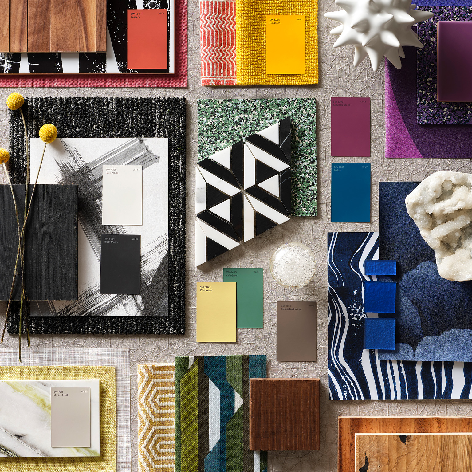
These days, we lead both digital and physical lives. Unfortunately, we’re not as skilled at navigating this divide as we think. While we crave the excitement of the fast-paced tech world, we also need to recharge.
Origin reflects the potential to balance these ideals and find a sense of harmony. Bright, free-spirited colors encourage us to nurture our inner child, but neutrals remind us to remain purposeful and grounded.
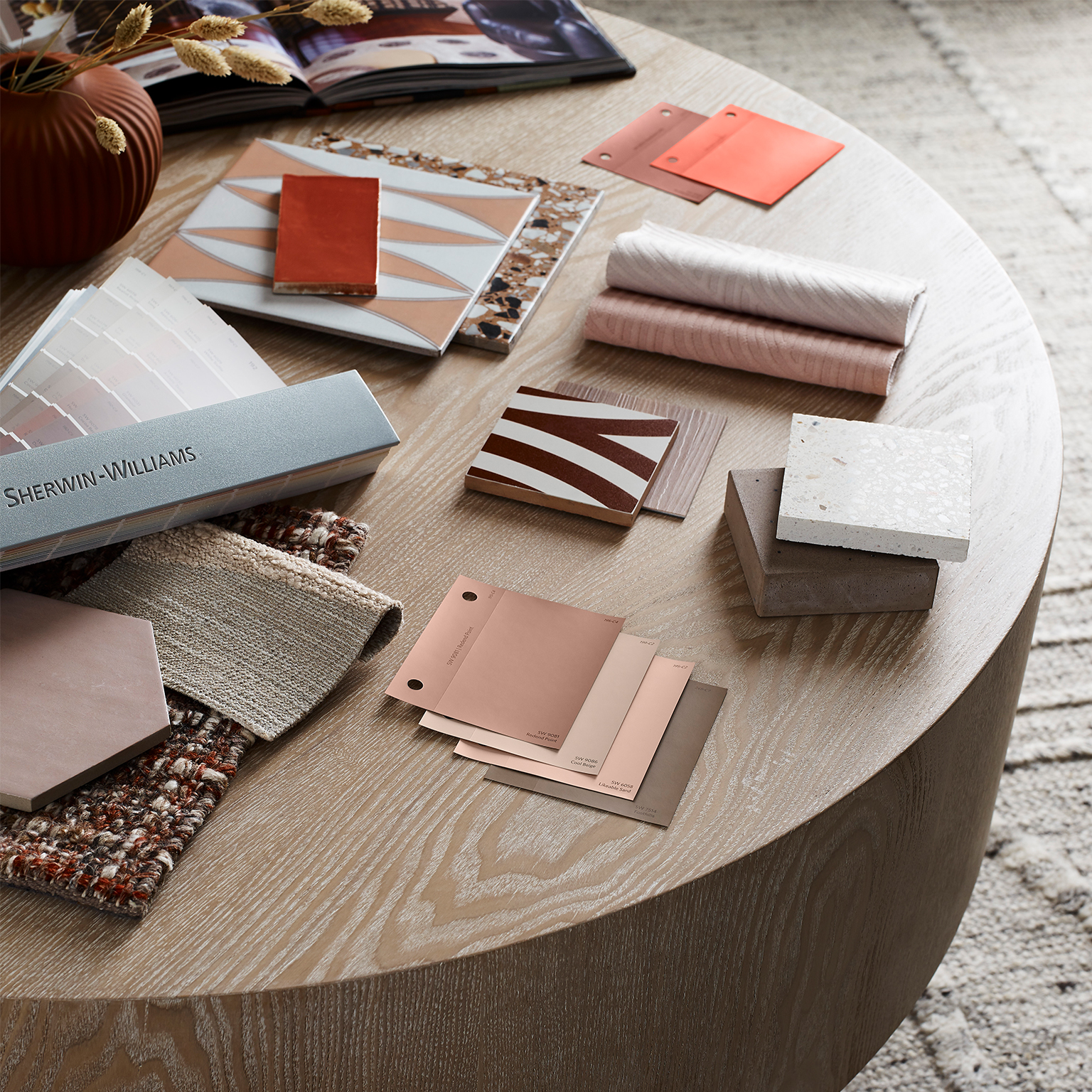
The 2023 Color of the Year
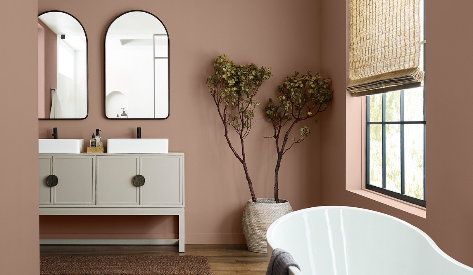
In addition to its Colormix collections, Sherwin-Williams always announces a Color of the Year. For 2023, this is Redend Point, which encourages us to “embrace a spirit of connection.” This color is perfect for establishing not only a personal sanctuary, but also places where we can recharge together.
This sense of community is made possible, in part, by Redend Point’s inherent versatility. It’s not exactly a neutral, so it should please anybody in need of energy or personality – but it’s not too bright for those who prefer understated design.
.jpg?width=1390&height=875&name=inspr-14%20(1).jpg)
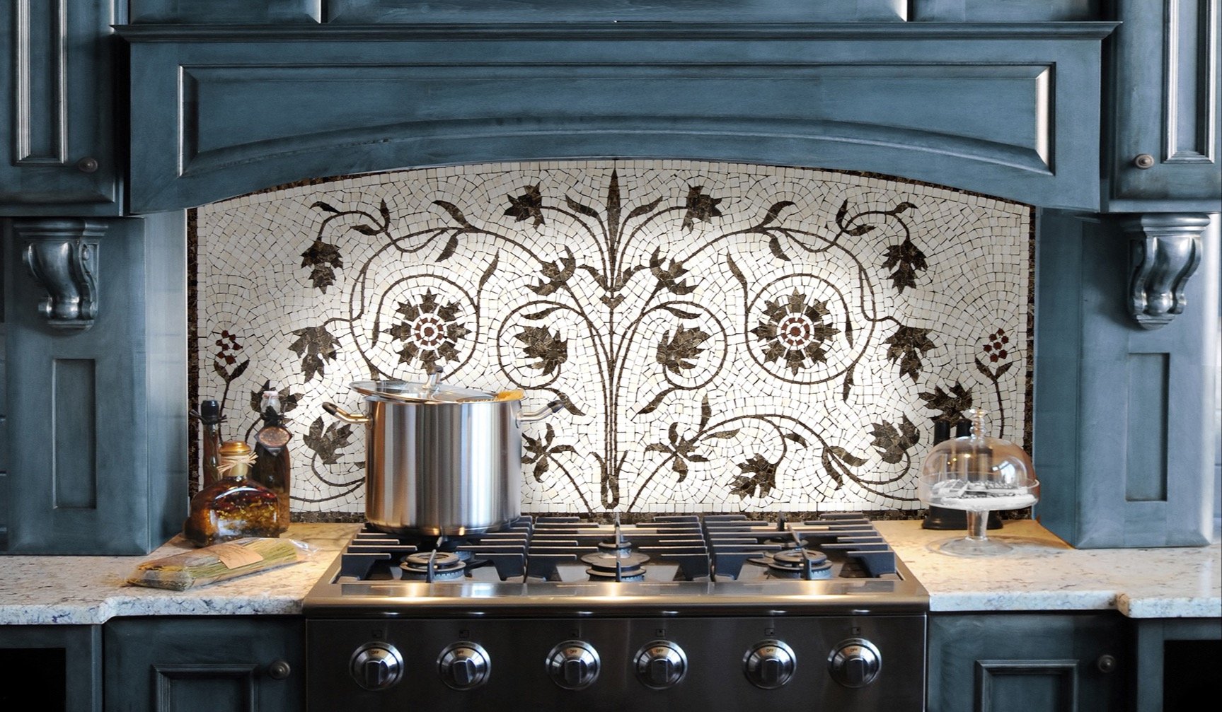
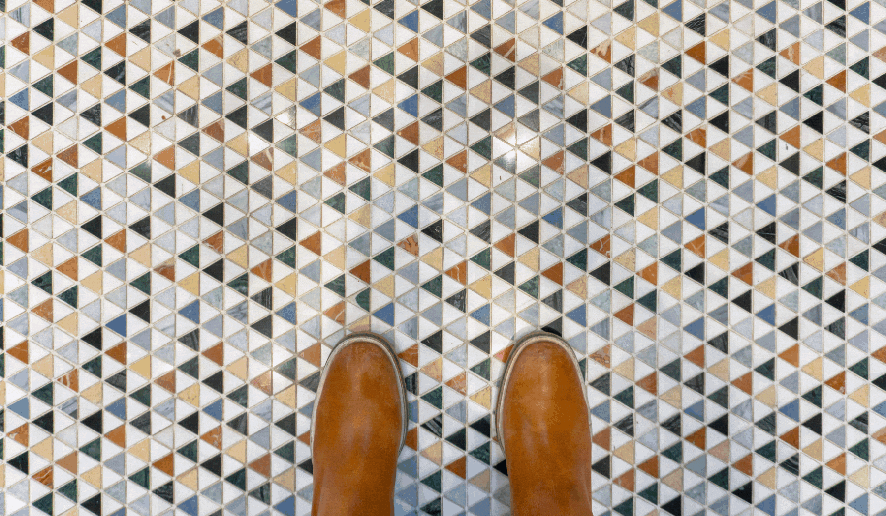
Tile Pairings at Decorative Materials
We're excited to see the dominant color trends of 2023 come to life. We anticipate that the year’s dominant tile pairings will build on the sense of calm already established by Sherwin-Williams' neutral palettes. Ideas worth exploring include:
-
Wood porcelain. If you love the warmth of hardwood but also appreciate the practicality of porcelain, you’re in luck: wood porcelain provides the best of both worlds. Stylish, yet durable, this look exemplifies everything we appreciate about the top interior design trends for 2023.
-
Kat + Roger. The perfect palette of earthy tones designed to evoke a timeless desert dream is match made in heaven with this year's top color picks. Use these ceramic pieces to add a pop of color to stand out next to neutrals or style in tandem with coordinating colors.
-
Kintsugi. The concept of kintsugi feels apropos for 2023: in repairing a world shattered by the pandemic, we can recognize all we’ve lost but also create something far more beautiful. In tile design, Kintsugi encourages us to be perfectly imperfect.
-
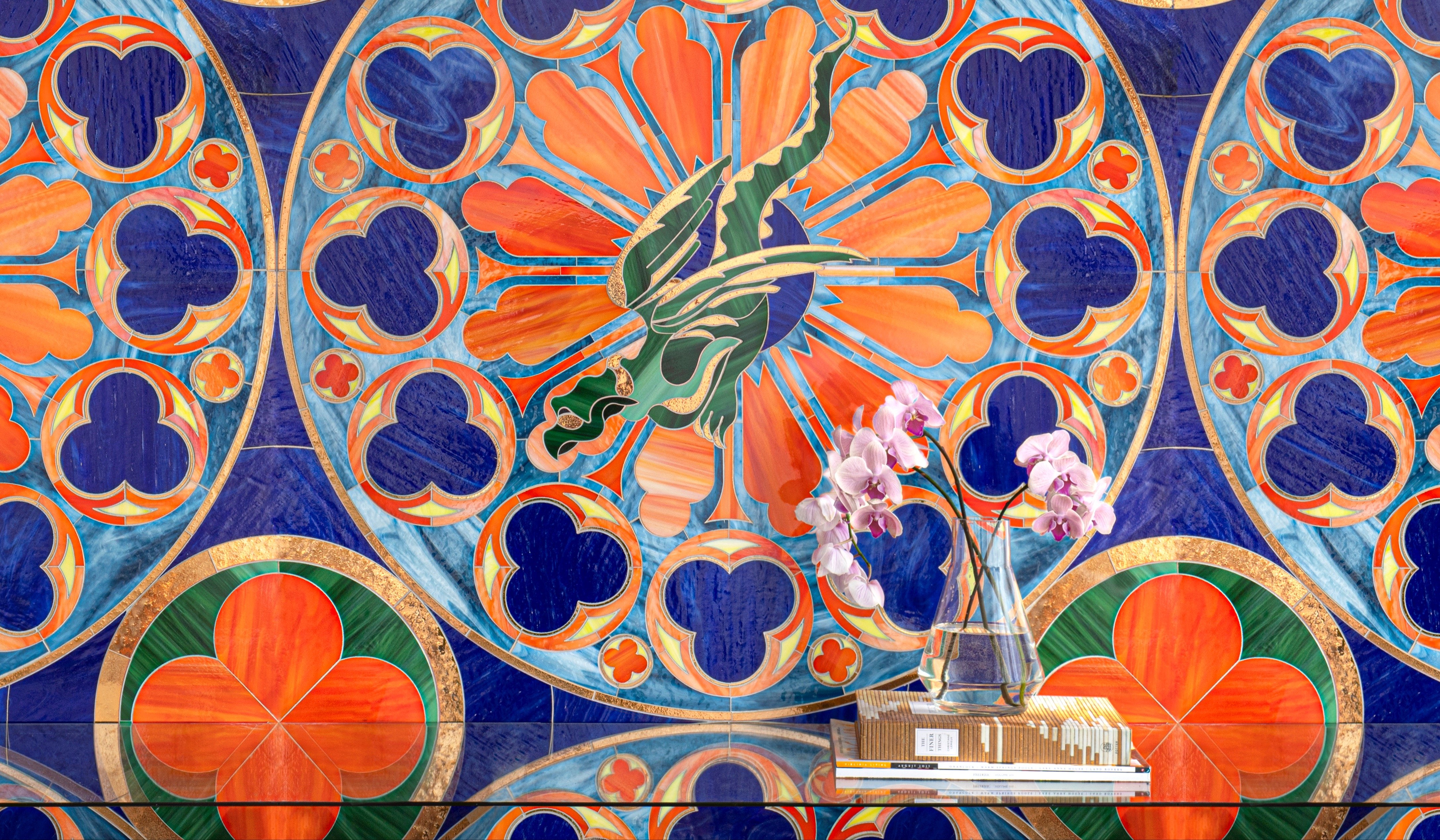
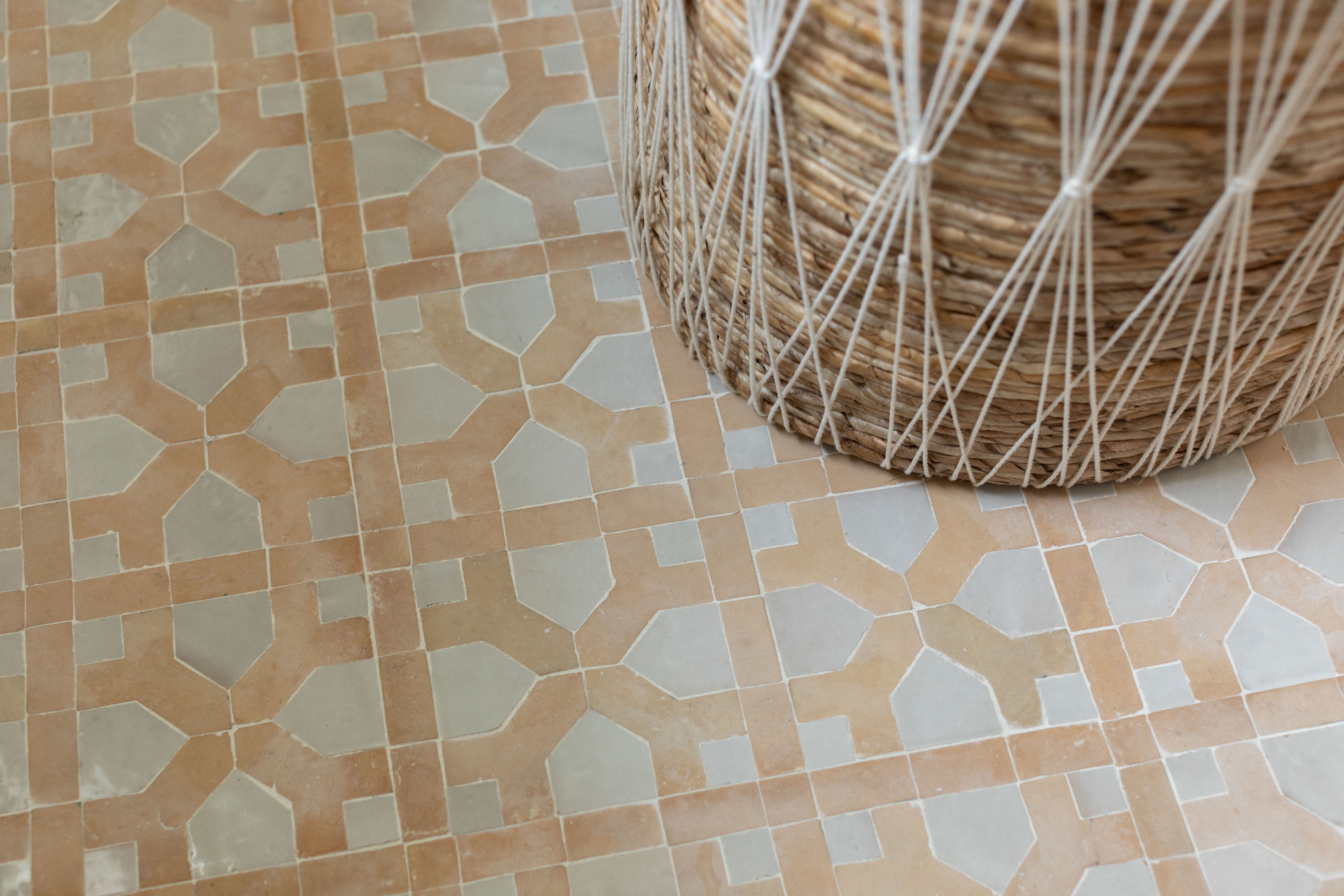
Zellige mosaics. Calm and intricate need not be opposite ideals. With the right colors and patterns, even the most detail-oriented mosaics can create a sense of serenity. This is best seen in Zellige styles: this glazed terracotta captures everything we love about Moroccan tile.
We’ve thoroughly explored grey these last few years and are ready to move on. It’s time to embrace new palettes that reflect our evolving mindset.
To that end, we’re thrilled to see rich and earthy shades adopted into Sherwin-Williams' Colormix collections and Color of the Year – and we’re excited to see how designers run with this trend.
As you seek to create spaces that feel like sanctuaries, don’t hesitate to turn to Decorative Materials for inspiration. We’d love to show you how these concepts play out in our showrooms. Feel free to get in touch and schedule an appointment.