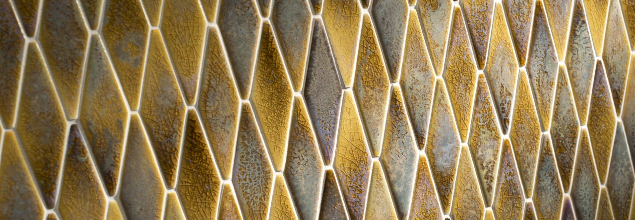
Color abounds! Even with countless colors at our disposal, we need to remind ourselves of that sometimes.
It’s easy to get caught up in the comfort and familiarity of creams, whites, beiges and greys. But the promise of color – and the challenge of color! – is always there.
Which brings us to Pantone’s Color of the Year for 2019 – Living Coral. We’ll admit, at first glance this bright coral shade seemed arbitrary, maybe even a bit perplexing. A color like this can be a tough sell in our notoriously pink-sensitive market.
However, since it was announced, we’ve had a chance to meditate on Living Coral. It’s grown on us, captured our interest and revealed intriguing design possibilities. There’s an unmistakable warmth that exists in this color – an immediacy and vibrancy. Simply put, Living Coral just feels life affirming.
Does this mean we’ll be stocking 10,000 square feet of this color in a 3×12 wall tile with coordinating trim anytime soon? Probably not. However, Living Coral does present an interesting jumping off point for us in terms of pulling together color palettes we feel are applicable and relatable.
Below we’ve paired a few products with Living Coral; we’ve done the same with the colors Cavern Clay and Metropolitan (the Colors of the Year for Sherwin-Williams and Benjamin Moore, respectively). We hope the results inspire you to come up with your own creative pairings.
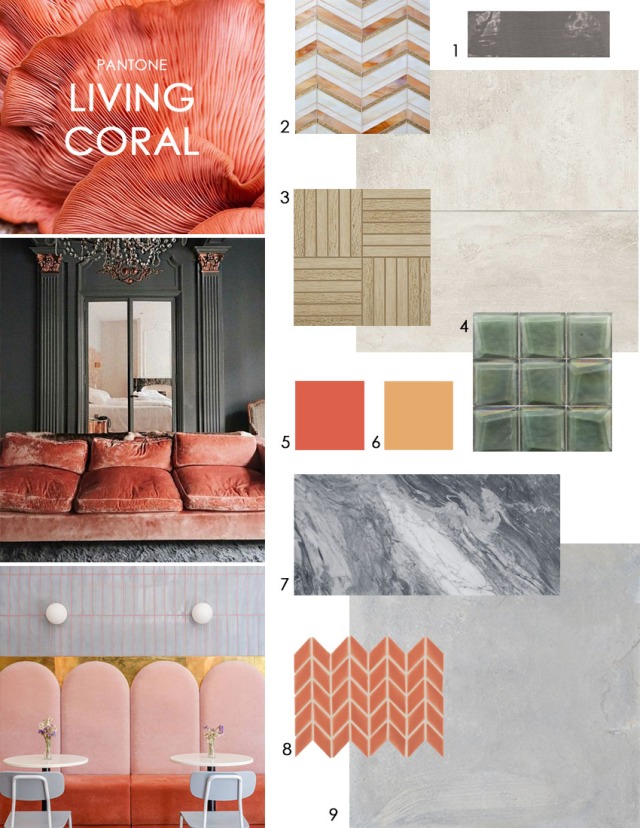
Thoughts on designing with Living Coral:
- Pairs well with both warm and cool tones
- Can go traditional or modern
- Perfect color for a subtle accent tile
- This color will pop when paired with green – its complementary color
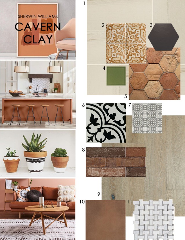
Thoughts on designing with Cavern Clay:
- Earthy in tone, captures a warm, modern desert aesthetic
- Pairs well with neutrals like cream, grey and blush
- Blues and greens are the perfect complement to this color
- Brings in textural elements both visual and tactile
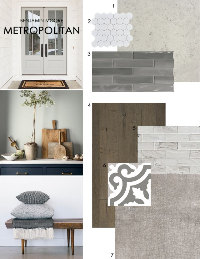
Thoughts on designing with Metropolitan:
- The perfect neutral backdrop for color, pattern and texture
- This popular neutral comes in stone, porcelain, ceramic and glass tile
- Pairs beautifully with wood tones
- Contrast with navy or black for visual depth and interest
So give color a chance! Try working it in to a cozy corner of your house or workspace. Feeling a bit bolder? Integrate a splash of color into your next tile project – our helpful showroom staff is available to offer design suggestions should you need it.
