article thumbnail

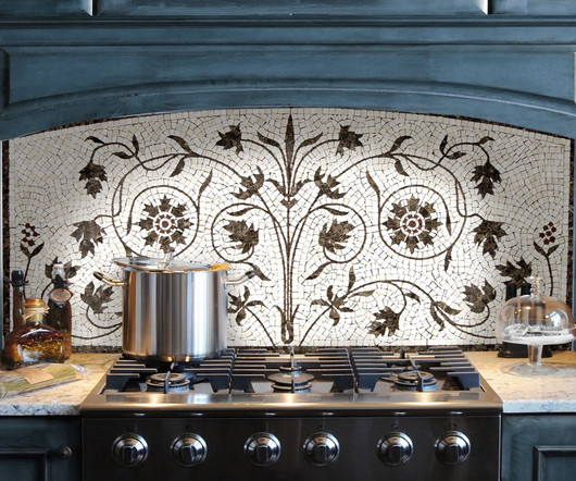
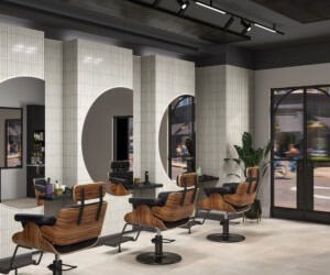
The Power of Contrast: Achieving Elegance with Black + White Tile

As The Tile Turns

Drawn to neutral colors but still want to make a bold statement? While there are many ways to play with color, the timeless combination of black and white always stands out. Black and white tile is the perfect choice for your project. The powerful contrast of this coupling creates an air of elegance that elevates any space.

Tile 171
article thumbnail

High definition porcelain tiles making a significant design statement at Surfaces.

CTDA's Tiledealer Blog

It is the latest addition to the company’s family of ever-expanding HDP High Definition Porcelain® Products. In its natural form this look is a stunning linear play of tone-on-tone colors which creates the contemporary appearance.”. “By We created contemporary colors that can be specified in any commercial space. “We

Porcelain 100
Insiders

Sign Up for our Newsletter

This site is protected by reCAPTCHA and the Google Privacy Policy and Terms of Service apply.

Trending Sources

article thumbnail

A Season of Change, Fall Ceramic Trends

Tile of Spain USA

And just as the outside world begins its cozy transition, we see a similar shift in the colors, textures and details used to decorate interior spaces. It’s time to put away those punchy pastels and say hello to raw colors and softer tones. Millstone, PLATERA. Saint Tropez, ROCA. Natural Finishes. Galaxy, KERATILE. XXL Formats.

Ceramics 246
article thumbnail

The 31 Best Residential Design Blogs Featuring Awesome Cement Tile (A Definitive List For Encaustic Tile Enthusiasts)

Granada Tile

A Target Home spokesperson, she focuses on creating homes that are quirky, attainable and filled with her favorite color, blue. In her hands, weird is definitely wonderful. Of all of the design blogs that cover cement tile, we give the prize to Justina Blakeney’s Jungalow for being the most colorful.

Cement 150
article thumbnail

Get Inspired By This 1970s Color Flashback

Freshome Design & Architecture Magazine

Get 1970s color inspiration from this stunning living room. Retro paint colors have us falling in love right now. Neutral colors have ruled the interior design world for years, but now we’re seeing exciting new colors everywhere. 1970s Color: Harvest Gold. 1970s Color: Harvest Gold. Image: MindfulDaze.

Colors 110
article thumbnail

The Maximalist Movement

As The Tile Turns

It doesn’t take a lot of expertise to implement an all-white aesthetic, but when bolder colors and patterns enter the picture, finesse is a must. Maximalism is the ultimate in high risk, high reward style but it is definitely worth exploring. Get it wrong and the look goes from dynamic to chaotic and cluttered – and not in a good way.

article thumbnail

Daltile launches Ravel porcelain collection

Floor Covering News

Daltile’s new Ravel assortment is the perfect design element to add this modern definition of luxury to a space, while standing up to real life activity through the performance benefits found in porcelain tile.”. Each of the colors showcases authentic veining visuals in both a matte and polished finish.